I. What if you can't remember the grammatical details?
When we use radial-gradient radial gradient, we will have some grammar in our brain, but we can't remember the details. So we want to find a case quickly to see how to use radial-gradient radial gradient. Usually a search will find that although it is a simple requirement, the pages that meet this requirement are not easy to find and messy.
Next time you encounter this scenario, come to our site to search for "radial gradient" or "gradient" directly, there will be a special article showing the basic grammar use case of radial-gradient radial gradient. The article shows 10 common use cases, I believe it can cover your use scenarios.
First, suppose we use the same HTML as a hint:
<div class="radial-gradient"></div>
Example 1: Basic and Simplest Use
CSS is as follows:
.radial-gradient {
width: 400px; height: 200px;
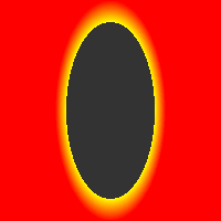
background: radial-gradient(yellow, red);
}
The final effect is as follows:
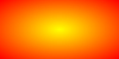
It can be seen that for radial gradient, the gradient distance and position are determined by the size of the container without specifying the gradient type and position.
For example, in this case, the ratio of width to height of the container is 2:1, and the final shape of the gradient is also an ellipse of 2:1, and the gradient color automatically terminates with the edge of the container.
The principle is as follows:
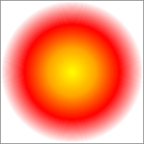
3. Example 2: Simple circular gradient
The CSS code is as follows:
.radial-gradient {
    width: 400px; height: 200px;
    background: radial-gradient(circle, yellow, red);
}
Its gradient range (gradient termination line) is shown in the following figure. It is found that the gradient termination line is not based on width or height, but on the farthest corner distance.
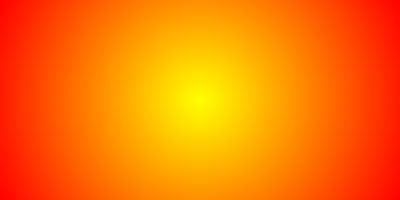
Its gradient range (gradient termination line) is shown in the following figure. It is found that the gradient termination line is not based on width or height, but on the farthest corner distance.
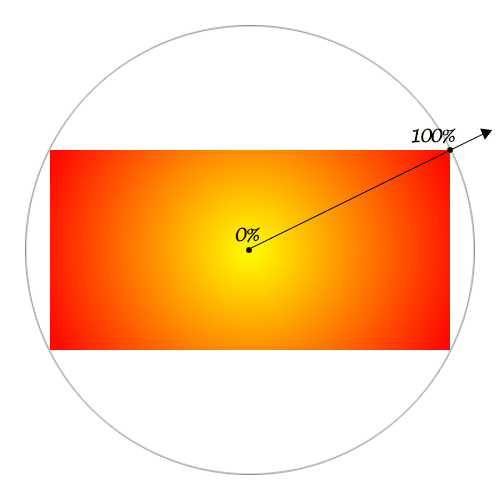
To prove that the above conclusion is relatively simple, we can calculate the half length of the lower diagonal line, which is Math.sqrt(200200 + 400400)223.6. So, we set up:
.radial-gradient {
    width: 400px; height: 200px;
    background: radial-gradient(223.6px circle, yellow, red);
}
You will find that the final effect is almost the same as the screenshot above. And the radius of 200px:
.radial-gradient {
    width: 400px; height: 200px;
    background: radial-gradient(200px circle, yellow, red);
}
When you take the color, you will find that the edge color varies greatly, which means that the default is not to render according to the shortest edge.
Example 3: Specify the starting point of the gradient
The starting point position can be specified by at, for example:
.radial-gradient {
    width: 400px; height: 200px;
    background: radial-gradient(circle at 50px 50px, yellow, red);
}
Small partners interested in web front-end technology can join our learning circle, because I am not 211,985, just an ordinary undergraduate, English is not particularly good, mathematics is not particularly good. So I chose the front end. In my sixth year of work, I am glad that I have chosen this road. 767-273-102 autumn skirt. I worked in a goose factory, and I fooled with the entrepreneurs. I want to share my technology with you. If you are still confused, I hope to help you with some of my meagre efforts. They are all people with dreams. We may be in different cities, but we will travel together. Front end, front end, front end
If you want the gradient to be an ellipse proportional to the container, circle can default, that is, direct radial-gradient(at 50px 50px, yellow, red) can also be.
We can also use percentages instead of 50px 50px, for example:
.radial-gradient {
    width: 400px; height: 200px;
    background: radial-gradient(circle at 12.5% 25%, yellow, red);
}
The effect is exactly the same.
Example 4: Specify the Gradient Termination Point
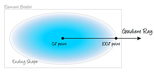
radial-gradient Radial Gradient supports four keywords to specify the location of the gradient termination point, as shown in the table below:
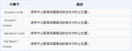
From the above illustration, we can see that the default value is farthest-corner.
Now, we are adjusting CSS as follows:
.radial-gradient {
    width: 400px; height: 200px;
    background: radial-gradient(closest-side circle at 50px 50px, yellow, red);
}
That is to say, the circular gradient terminates at the shortest edge. The result is as follows:
Example 5: Specify Gradient Color Breakpoints
If multiple colors are specified without specifying the location of specific breakpoints, these colors are evenly assigned 0%-100% gradient areas, for example, the following four color gradients:
.radial-gradient {
    width: 200px; height: 200px;
    border: 1px solid silver;
    background: radial-gradient(closest-side circle, yellow, orange, red, white);
}
The results are as follows: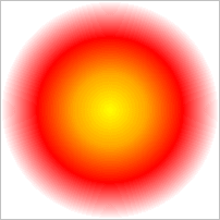
But we can't see from the naked eye whether the gradient area is evenly distributed, but we can verify our point of view in other ways, as follows: CSS specifying the location of the color breakpoint:
.radial-gradient2 {
    width: 200px; height: 200px;
    border: 1px solid gray;
    background: radial-gradient(closest-side circle, yellow, orange 33.33%, red 66.666%, white);
}
Since the gradient color defaults to 0% for the first color and 100% for the last color, the breakpoint positions of yellow and white above can be defaulted.
Then we find that the effect is consistent with the above:
Press the first circle gradient to cover the back circle instantaneously. If the two gradients are different in color, the naked eye can feel a significant change at this time; but in practice, it is as if the latter gradient suddenly disappeared, which shows that the effect of the two gradients is actually the same.
Example 6: Radial Gradient of Elliptic Type
For circular interfaces, we only need to specify a radius, but for elliptical radial gradients, we need to specify both horizontal and vertical axis lengths, for example:
.radial-gradient {
    width: 200px; height: 200px;
    background: radial-gradient(50px 100px ellipse, transparent 40px, yellow 41px, red);
}
The first value in 50px 100px ellipse is 50px for the radius of the horizontal axis and 100px for the radius of the vertical axis, so this statement represents drawing an ellipse of 100px in length and 200px in height.
The effect is as follows:
It should be noted that in the CSS code shown above, there is a 1px deviation transition from transparent to yellow boundary, that is, transparent 40px. yellow in yellow 41px is 41px, not set 40px. The reason is that in Chrome, if the color is directly zero deviation transition, there will be more severe jagged, similar to the figure below. (Set the background color to #33):
Sawtooth can be effectively avoided by 1 pixel or half pixel transition buffer.
Example 7: Accumulable Radial Gradient Background Map
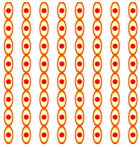
We can add several radial gradients together to achieve certain effects, such as the following CSS:
.radial-gradient {
    width: 200px; height: 200px;
    background: radial-gradient(50px 100px ellipse, transparent 40px, yellow 41px, red 49px, transparent 50px),
                radial-gradient(30px circle, red, red 29px, transparent 30px);
}
The "evil king's true eye" effect has been achieved.

9. Example 8: Size control of gradient background
With background-size control and background repetition, we can achieve a gradient complex texture effect.
.radial-gradient {
    width: 200px; height: 200px;
    background: radial-gradient(5px 10px ellipse, transparent 4px, yellow 5px, red 6px, transparent 7px),
                radial-gradient(3px circle, red, red 3px, transparent 4px);
    background-size: 25px;
}
Then you can see a big wave of wheel-eye writing:
Usually when we use radial gradient to construct some simple and practical graphics, background-size is often the key attribute. For example, we want to achieve a water wave effect, we can do this:
.radial-gradient {
    width: 200px; height: 100px;
    background: red;
    position: relative;
}
.radial-gradient:after {
    content: '';
    position: absolute;
    height: 10px;
    left:0 ; right: 0;
    bottom: -10px;
    background: radial-gradient(20px 15px ellipse at top, red 10px, transparent 11px);
    background-size: 20px 10px;
}
Then there is the effect shown in the following figure: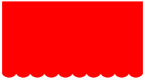
10. Example 9: Repeatable radial gradients
If we want to achieve repeatable radial gradient, we can also use the original repeating-radial-gradient() method, which is especially suitable for achieving the effect of light wave diffusion from the center.
However, the actual application scenarios of repeating-radial-gradient() are actually very limited compared with repeating linear-gradient () method. Because, in actual development, we seldom use the light wave effect that diffuses from the center.
Except for some ripple-type effects, such as water waves, sound waves or record textures:
The following CSS
.radial-gradient {
    position: relative;
    width: 262px; height: 262px;
    border-radius: 50%;
    background: linear-gradient(30deg, transparent 40%, rgba(42, 41, 40, .85) 40%) no-repeat 100% 0, linear-gradient(60deg, rgba(42, 41, 40, .85) 60%, transparent 60%) no-repeat 0 100%, repeating-radial-gradient(#2a2928, #2a2928 4px, #ada9a0 5px, #2a2928 6px);
    background-size: 50% 100%, 100% 50%, 100% 100%;
}
.radial-gradient:after {
    position: absolute;
    top: 50%; left: 50%;
    margin: -35px;
    border: solid 1px #d9a388;
    width: 68px; height: 68px;
    border-radius: 50%;
    box-shadow: 0 0 0 4px #da5b33, inset 0 0 0 27px #da5b33;
    background: #b5ac9a;
    content: '';
}
Example 10: Radial Gradient as border-image
Radial gradient can be used not only as a background image of backgrounds, but also as a border-image border diagram.
For example:
.radial-gradient {
    width: 100px; height: 100px;
    border: 50px solid;
    border-image: radial-gradient(circle, transparent 50px, yellow 51px, red) 50 stretch;
}
Natural hollow-out effect, but unfortunately border-image can not work with border-radius at the same time, otherwise, border-image will be a bombshell.